Edible seasons is a bachelors project in graphic design finished in spring 2022. It started off in an interest in local produce and the question of how much we know of what we grow in Sweden and when different fruits and vegetables are in season. I wanted to create something that was informative and that could take place in the everyday life as a reminder and encouragement to care about what we put in our bodies and how that effects our climate. There are a lot of reasons why we should eat fruits and vegetables in season: they taste better, shorter transports and less energy consumption (when for example heating greenhouses) benefit the climate and reduce food waste, they have higher nutritional value, are cheaper for the consumer and have been exposed to less pesticides.
Since I am an illustrator I felt that this was a suitable moment to combine this with my graphic design work and landed in an idea of a calendar of fruits and vegetables in season. Although I had found the core of my project it evolved from this into a campaign with the same purpose. In this project I needed to work with a sender, I chose Naturskyddsföreningen because of their extensive work with environmental questions and the fact that they have a high level of reliability in the public eye. With this said I want to make it clear that this project is not actually connected to them in any real way and that they are just a hypothetical sender for this campaign.
The target group I worked with was private individuals residing in cities between the ages of 26-40. Their interests included health, climate and diet. I chose this group because of their presence on the job market which means they have households and economies to choose what to consume. For this group it is more important who sends a message then what is said, if the source is a friend, influencer or a company/organisation that is trusted this needs to be highlighted clearly and early in the marketing.
After an extensive process of research, sketching, drawing conclusions and making decisions in regard to my sender, my target group and related design the campaign was finished. Below is the result of the calendar.

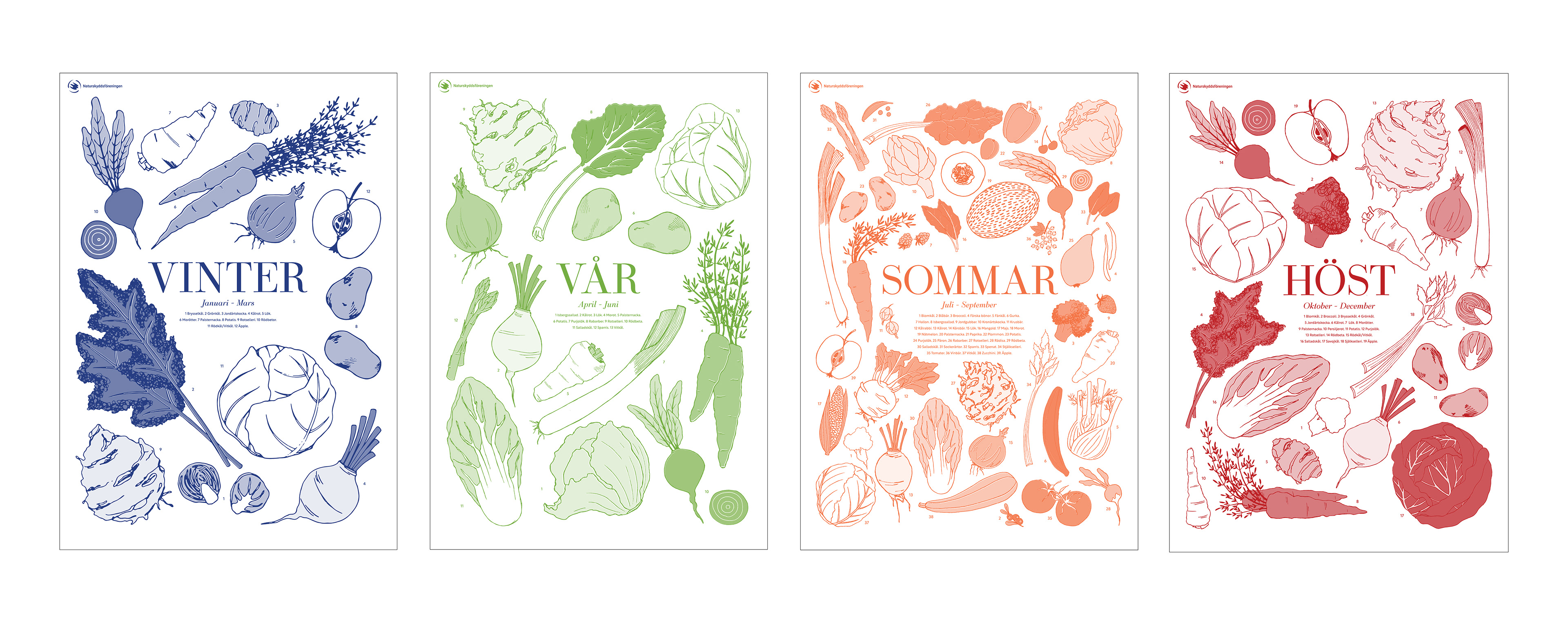
Initially I printed the calendar in A2 with the risograph printer at the university. This is also how the colors are selected, I've chosen the inks I found most fitting to each reason and tweaked the colors to the correct tints by printing a second ink upon the first. Winter stayed in one color while spring and summer got an extra layer of yellow and autumn had a thin extra green layer.
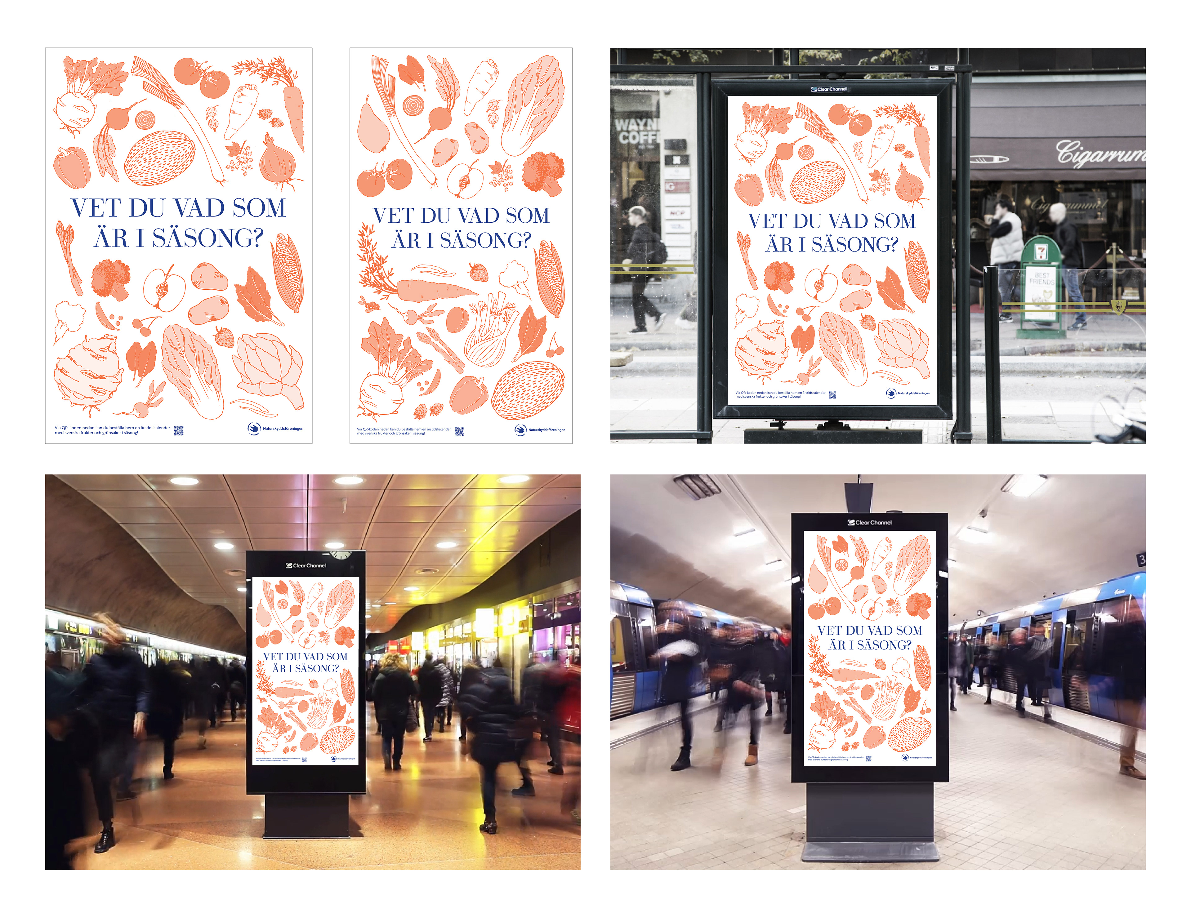
We usually shop or plan what to eat when we are on our way somewhere, traveling in connection with work and home, in a shopping center or out shopping to stock up. The marketing for the campaign is intended to be visible in these places, at bus stops, in the city, at train stations, adjacent to shopping centers and large grocery stores such as Ica maxi. It can then function both as an information that the campaign exists and an encouragement to think about what we eat and shop.This is why I chose to work with Clear channel displays.
I have created two still images in different formats for these displays and a short animated loop. This kind of marketing needs to catch our attention quickly, so it needs to somehow "pop". Initially, I worked a lot in green both in instagram content and marketing in the city. It looked nice but I felt that it could too easily blend in with other eco-campaigns or store chains like Coop and therefore tested with orange as the main color. The idea is that the campaign will be active in the summer and it then felt logical to choose color and illustrations from the summer poster in the calendar. The orange worked more distinctively but is very light and therefore does not work optimally when it comes to readability, especially not at a distance. The idea is that the marketing needs to be readable in passing, from a bus or car. I had previously done a test with the calendars where I had color on the illustrations but had the text in black. This resulted in a complete change in the hierarchy of the layout, initially the illustrations were the first thing one saw but now the text shone like a neon sign. I changed it back in the calendars but instead took this experiment with me when working on the marketing. The text and information turned blue while the illustrations remained orange. Because blue and orange are complementary colors, they capture attention effectively while emphasising each other. The reason I did not use red and green instead was simply that the color combination looked too Christmas-like. However, this would have been a good fit for a winter version of the campaign.
When it comes to content, it needs to be easy to read and understand, even on the go. As I said, the displays will be located in places where people are constantly in motion. I therefore wanted the message communicated without having to be explained. The question "Do you know what's in season?" together with a whole bunch of fruits and vegetables gives a quick and clear idea of what it's all about. Anyone who is interested can then go directly to the campaign's website via the QR code.
When it comes to content, it needs to be easy to read and understand, even on the go. As I said, the displays will be located in places where people are constantly in motion. I therefore wanted the message communicated without having to be explained. The question "Do you know what's in season?" together with a whole bunch of fruits and vegetables gives a quick and clear idea of what it's all about. Anyone who is interested can then go directly to the campaign's website via the QR code.
The campaign website is intended as the campaign's anchor, it is located in connection with Naturskyddsföreningens website (atbaraarstider.naturskyddsforeningen.se) and contains information about the campaign and its purpose, reasons to eat in season, a way to order the seasonal calendar and the opportunity to become a monthly donor to Naturskyddsföreningen.
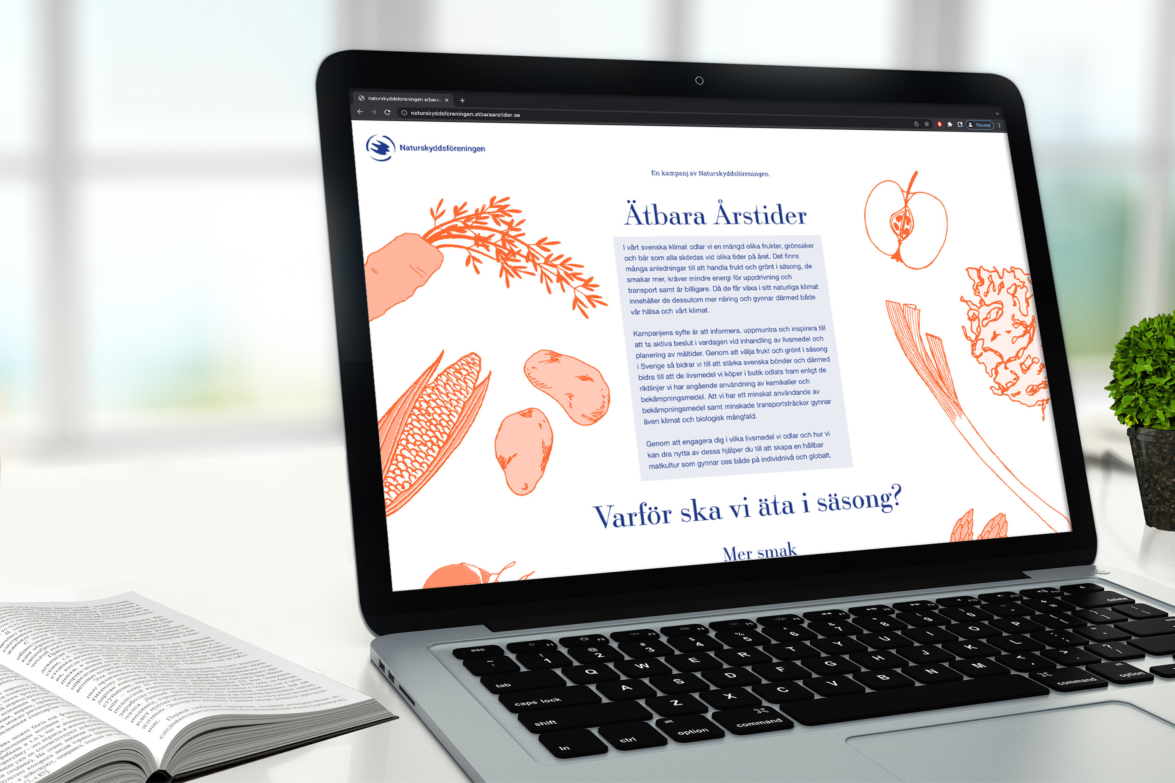
When I creating the campaign's website, I looked at the websites of various campaigns and organisations for reference material. However, it felt natural to start from my sender's current strategy instead of reinventing the wheel and creating something completely different. I have looked at Naturskyddsföreningens previous campaigns Operation save bees, Switch to eco and Silent forest where they have used a simple and informative campaign website linked to their own website and a page on "naturskyddsföreningen.se" where they presented the campaign. In my case, the campaign website would be called "atbaraarstider.naturskyddsforeningen.se".
The campaign's website is primarily active while the campaign is active and then becomes more difficult to reach even if it remains. However, the information page on Naturskyddsföreningens own website remains as documentation. To create the Edible Seasons campaign website, I have therefore started from the campaign website to Silent Forest and created a similar one where I used the same visual approach as in public marketing to create continuity and recognition. I have also created a page on Naturskyddsföreningens website to link to the campaign and push for it.


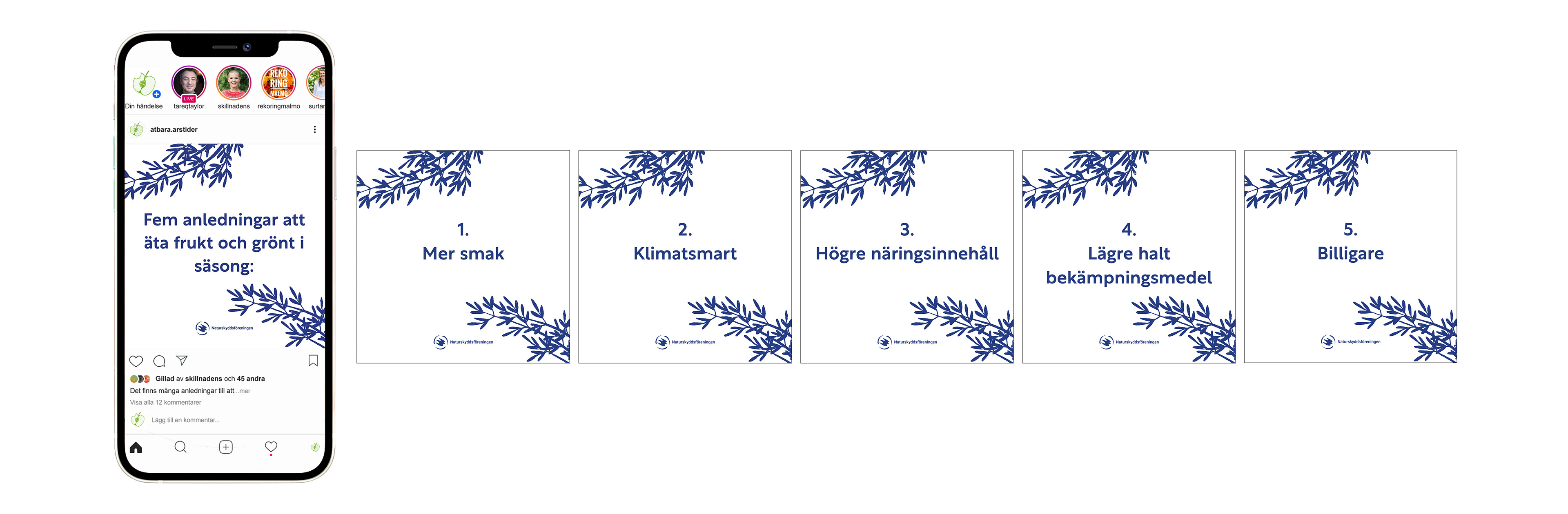
The campaign's instagram account is intended to engage and involve people in the campaign. The content is filled with information, recipes, tips, crafts, inspiration and influencer guests. As I said, my target group listens to who says something before they hear what is being said. I therefore felt that it was important that various actors in, for example, cooking, cultivation, fermentation, health and climate issues linked to diet were allowed to take place in the account together with the campaign's own content. This means that the campaign is spread outside its own channels and on a wider range of platforms. The campaign's own content uses all four colors previously chosen to create variety and a colourful expression. Only the influencers contributions and pictures of food for recipes are presented as color pictures. The remaining posts should include campaign colors, fonts, and illustrations. To connect the color images more strongly to the design language, I have put them in a type of "frame" where the tops of the carrots are included as a visual element. In posts and stories, the seasonal calendar will also be marketed and refer to the campaign website. On Instagram, I mainly use the Rustica font for the simple reason that it is selected for its clear readability and therefore works well in smaller formats such as smartphones.
The campaign will also be marketed on Instagram with the help of ads. On an image platform like Instagram, the eye is captured by movement, this also so that most of the ads on the platform move. I have therefore chosen to work out an advertising video that will capture interest and lead the observer further into the campaign's Instagram profile. The ad consists of two movie clips, the first of apples on trees and the second of an apple pie. The film is in duo-tone, blue and orange, to connect with the rest of the marketing. The message in the film tells the viewer that there are many reasons to eat fruit and vegetables in season (apples on trees), that more taste is one of them (apple pie) and encouraged to discover more benefits and to enter the campaign. I wanted it to be simple and enticing. I chose to have Naturskyddsföreningens logo constantly visible due to my target group, that Naturskyddsföreningen is the sender is important to create trust in the campaign especially since the Instagram account is called something else and this is not completely obvious.